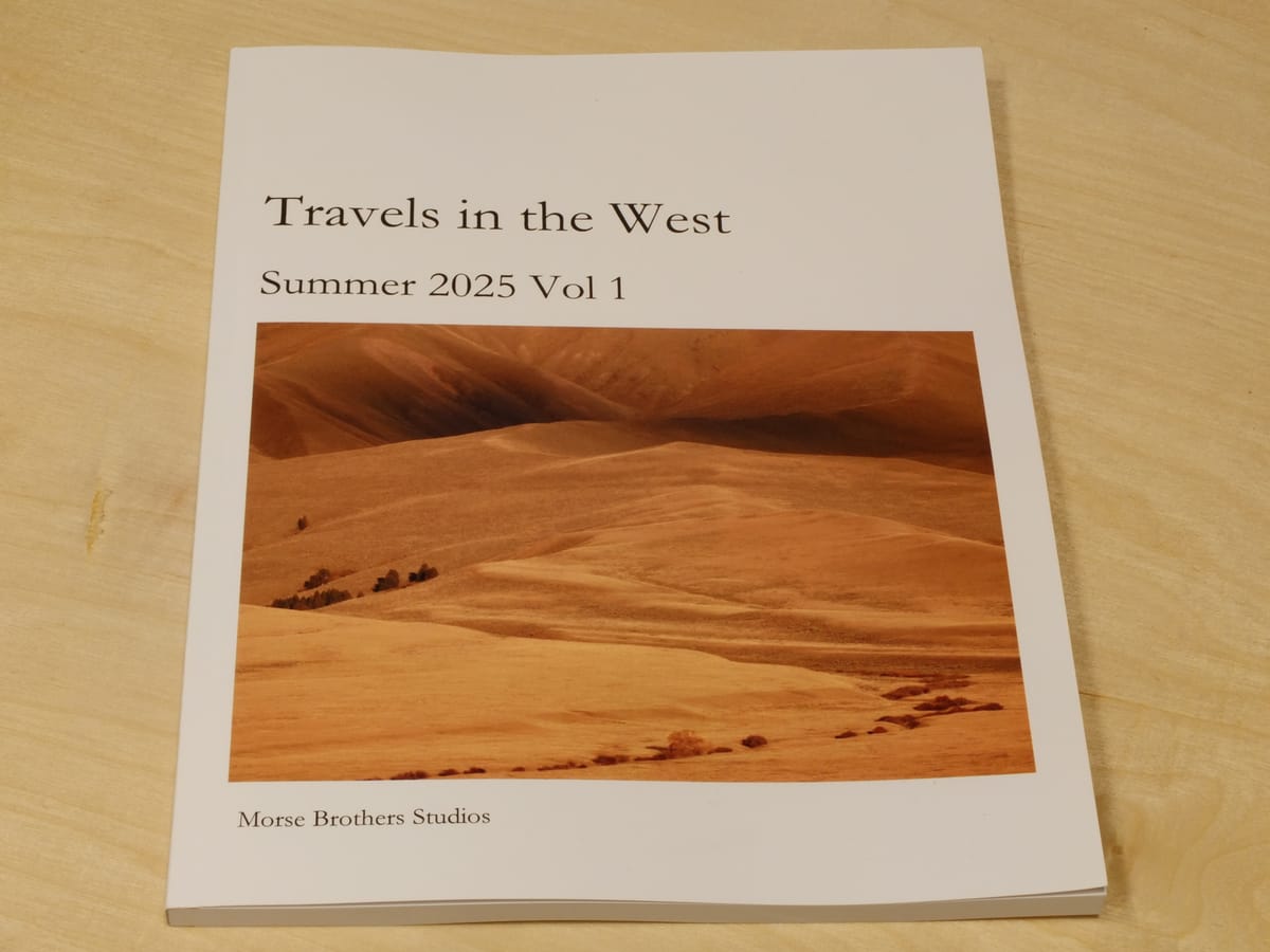
Use of Print to Create Archives
I have been writing a photographic blog in various forms for many years. I started on Blogger, moved recently to Substack, and now host it on a paid platform called Ghost.
In the past, I’ve printed my photographs in many formats: darkroom silver gelatin prints, photo books, color prints, and small-format books.
I’m now beginning to use the magazine format as a kind of archive for some of my writing and photographs. Part of this is to share with interested friends and family, but it’s also a way of granting the work a sense of permanence. I suppose jumping from platform to platform—and seeing how rickety each of them can become—has pushed this idea to the forefront of my thinking.
I’ve tried a few printers and have formed a kind of allegiance to Mixam, whom I started using when I lived in the UK. They struck the perfect balance between price and quality. They seem more consistent and affordable than Blurb, and better than Lulu, for instance. When I moved to the USA, I was pleased to find they had a presence here as well. So far, they’ve been just as reliable as I’ve come to expect.
I began with my most recent posts and worked backward until I had just over 100 pages. Mixam accepts PDF files formatted to their specifications. I use Word for composition and editing. It’s not the most convenient tool, I’m sure, but I know it well and already own it. It’s a simple matter of saving as a PDF and uploading it to the Mixam website for review. I iterated a couple dozen times before I was ready to commit to printing.
This first copy is a proofing run, so I ordered two copies. It cost me about $100, including shipping. The price per unit drops significantly with volume—50 copies brings it down to about $11 each.
I’m not a fan of the portrait magazine format for photography, especially landscape photography, which benefits from a wider spread. However, the blog itself is presented that way, and it’s a less unwieldy way to read. It also seems to be all the rage…
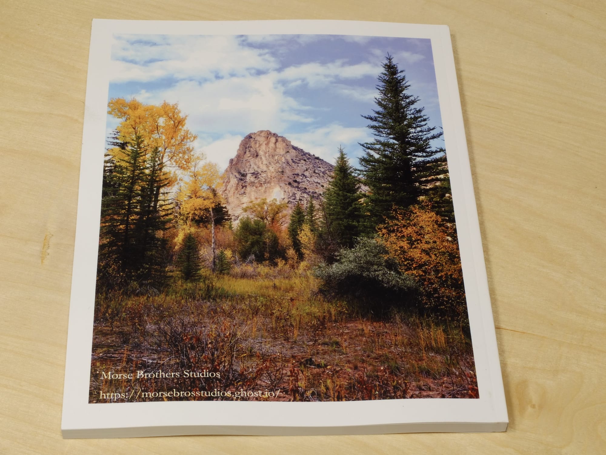
I selected 8½ × 11-inch perfect bound. The paper is a hefty 80 lb stock with a satin-coated finish. The cover is also 80 lb paper with a satin finish and their “soft touch laminate” for added durability.
The proofs arrived today, and they’re very pleasing. I’m still playing with the format. The chapter layout is as follows: a blank left-hand page, with a large photo, title, and teaser text on the right.
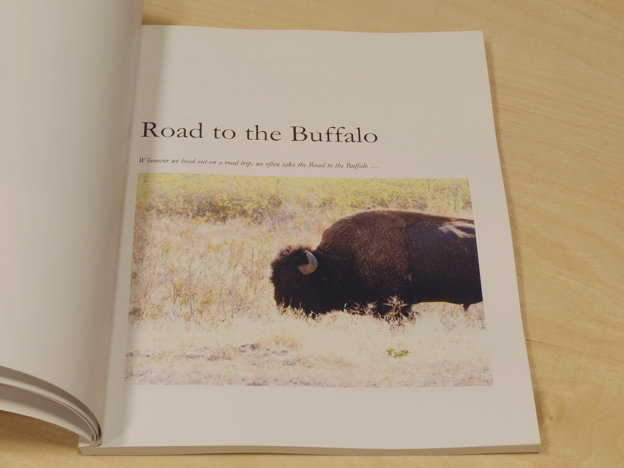
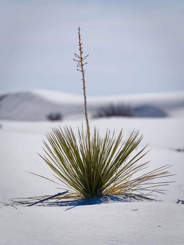
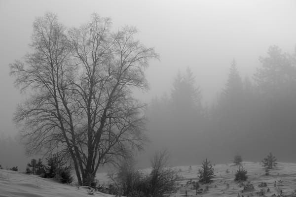
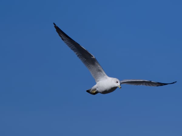
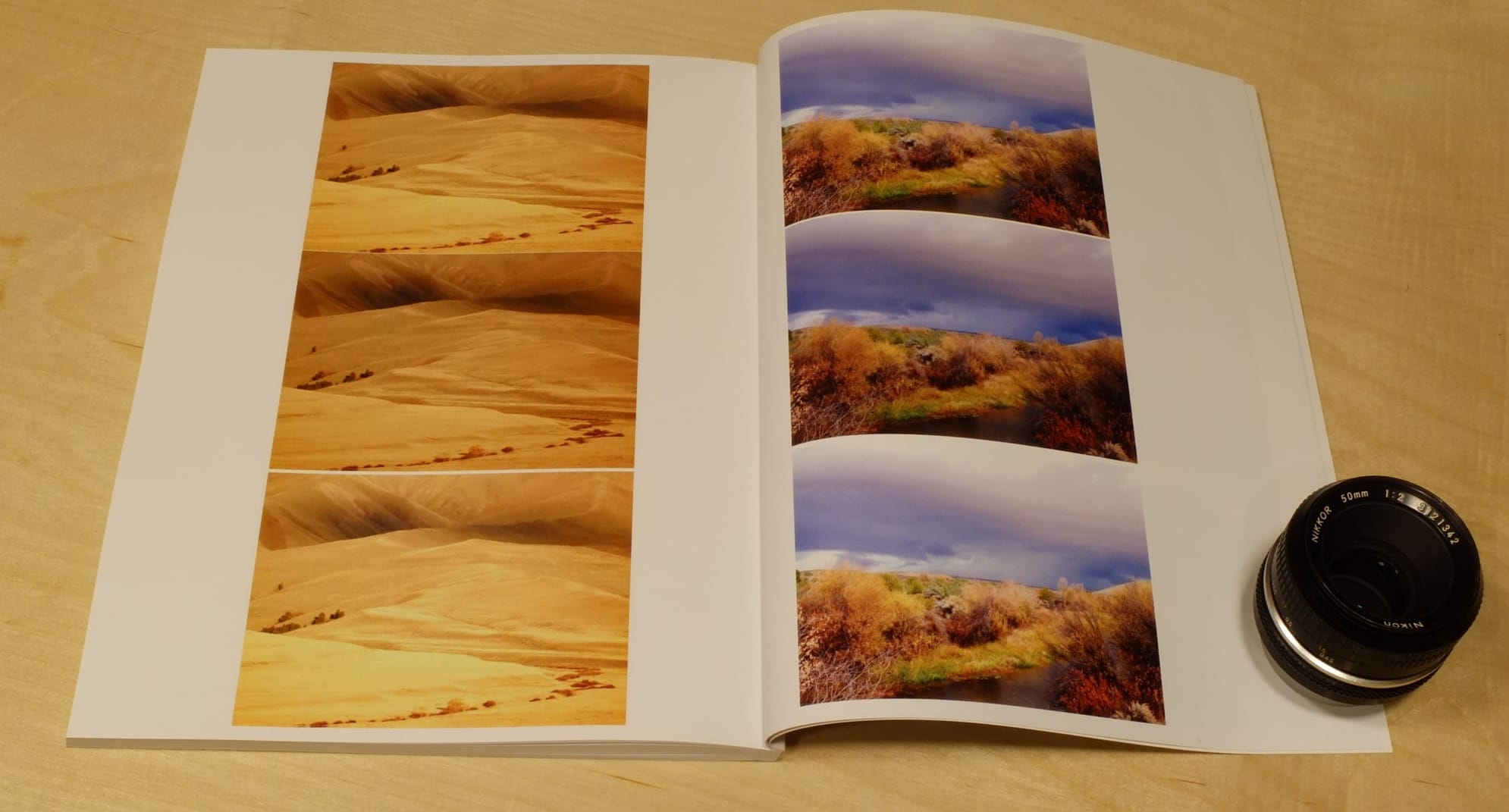
Other choices are how many and what size photos. As seen on the following pages there are different choices regarding placement of photos versus how many pages. The temptation is to make every photo large but that means a very thick magazine and little room for text.
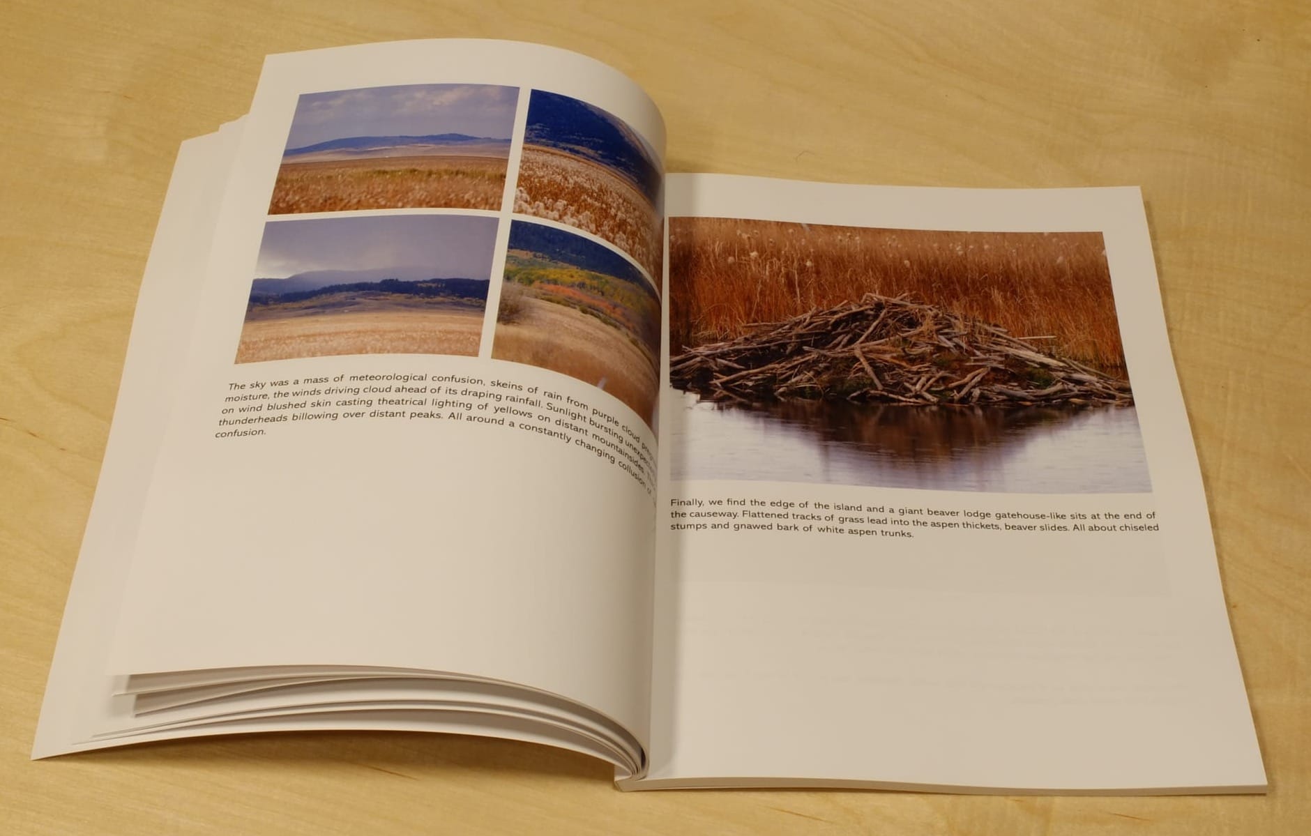
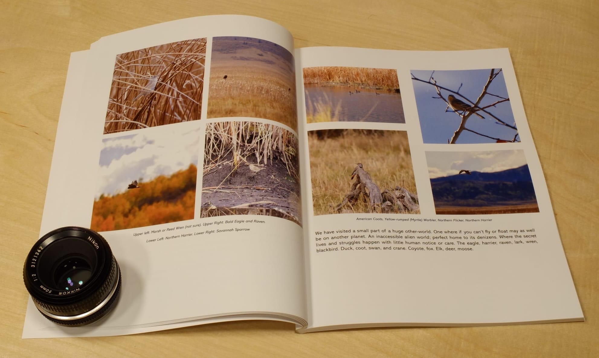
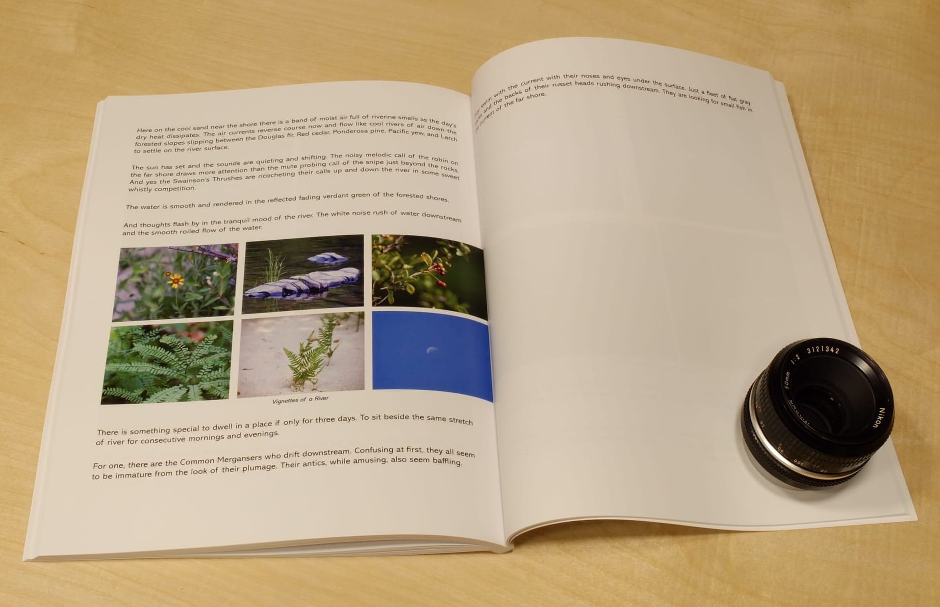
I think part of the solution is selecting images that work well as small pictures. Those with a single simple subject. Larger images should probably be reserved for larger subjects with impact.
I still need to add the title page, copyright page. I am also contemplating a table of contents though that then adds the complication and clutter of page numbering. So part of me wants to do without it. A compromise may be an ordered list of articles.
The cover text needs some work. Mostly font sizes I think.
I find the most challenging part of printed material is getting the photographs to look right. Mixam does the best job in general but there is bound to be variation from print run to print run. I find generally the challenge is muddy or compressed shadows.
For this proof I set the photos to 10% brighter. I also put a range of test photos in the back with one unadjusted surrounded by one at 10% brighter and another at 20% brighter. in almost every case the normal exposure was fine. The 10% higher brightness was also good and only in one or two cases better. I think I am going to stay with unmodified as that is easier to keep track of.