Some Initial Prints (Warmtone)
Film from Digital: Road Trip Images
Note: This post was started early this last summer and got lost in my preparations for a final move to the USA. It was meant to be longer but because of the rushed preparations I have left it as it is…
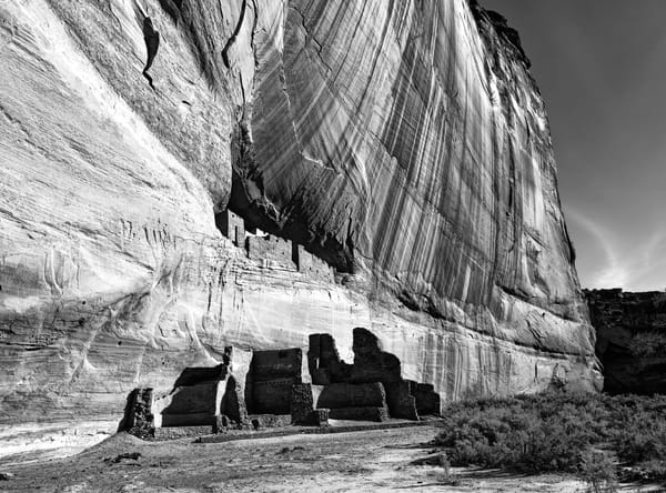
Well Charlie Dodge at Gammatech came through again I got my negatives before I had to head back to the UK. I have a nice roll of new negatives to print from my recent travels. As mentioned before I decided on medium format images to make it easier to make prints in my primary dark room.
I kicked off with some landscapes and went with Foma Warmtone paper for starters. I have recently been experimenting with Warmtone paper (see link below).
 Doug Morse
I prefer the look of the Foma Fomatone paper compared to the Ilford Warmtone, but these are mostly still initial impressions. The Foma paper is cheaper as well. Fomatone is also coated on a warmer paper base not a baryta coated paper. This makes the whites warm but also means less contrast because we judge contrast from pure black to pure white. A warmer tone emulsion means lower Dmax for shadows and a warm colored paper base means less range in the highlights. (Baryta is barium sulphate which is one of the whitest (and brightest) substances known and is used to calibrate colorimetry equipment) The paper is very slow, making exposures quite long for large prints with dense negatives. To avoid running the lens wide open I ended up changing to a 150W bulb.
I am still learning what this paper is best at. Warmtone seems to work well for lower contrast subjects though there is a struggle to boost enough contrast to get the image ‘right’ with multigrade papers. I tend to use the #5 filter exclusively (I do split filter printing). I will also resort to pulling the print ‘early’ from the developer to enhance highlights. The warmer tone seems easier on the eyes and more inviting to look at.
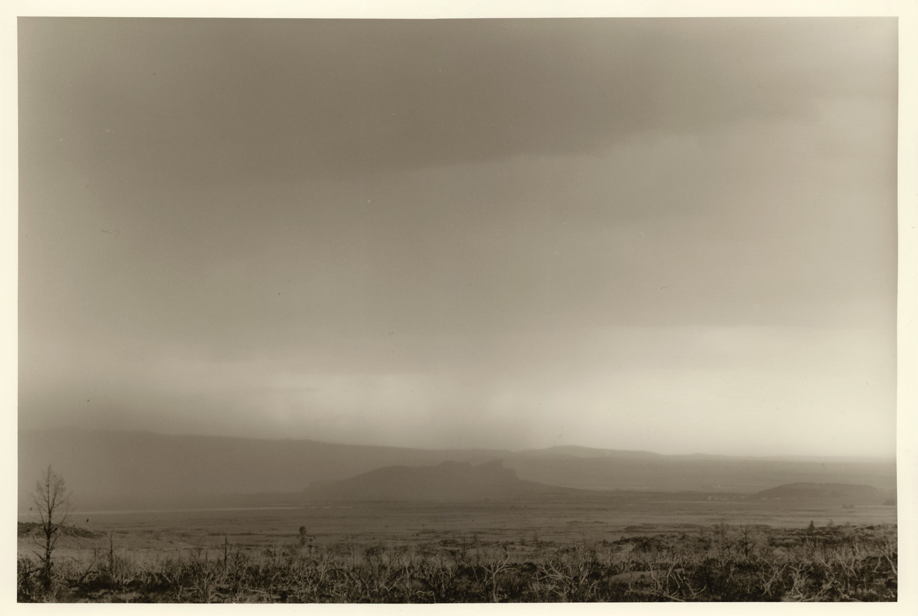
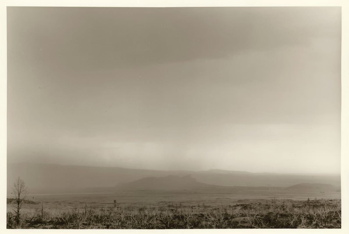
The first print was from my visit to Lava beds National Park. There were thunderstorms in the area and I got this nice image of Castle Rock across the valley in the rain. I had to print his exclusively with the #5 hard filter and burned the foreground a full stop up to the edge of the mountains. This helped improve the contrast with Castle Rock and bright area of sky near the horizon.